Saturday 16 June 2012

DAB510 - Week 13 Reflection

This post is to summarize the work done in week 8-14.

In week 8, i proceeded with resolving the spatial analysis and implemneting it at a site scale. I felt that a functional sporting layout would be ideally in a extroverted circular shape where spaces would be able to be tied together and easy transitions. The problem was that with the constraints the spaces would not fit on the site. This site is quite linear and resulted in a very linear resolution.


Preliminary sporting layouts and spatial analysis. The sports were identified as sports that high schools lack facilities for sporting development. PCYC's also have these facilities but require money. Why not create a facility that is accustomed to the Brisbane culture for free? Wouldn't bringing together be a good enough reward rather than costs?

Preliminary organic cover sketch 1

Preliminary organic cover sketch 2 
Preliminary organic cover sketch 3 

All these organic forms were generally inspired from Frei Otto's olympic stadium. I found applying these sort of approaches to the site difficult due to the scale, site and structure system.


Developed planning layout to scale. I identified that i could fit all the sporting facilities on site minus the full cricket field and a full rugby/soccor field. I didnt find these an issue because of the intent of the design.

Typical section idnetifying the connection of the cliff and heritage building

A possibility of connecting the cliff one step futher by creaing a hollow section where people can access.

In week 9, i proceeded with creating a model as i felt that the cliff would be vital to the final design and the best method of presenting it would be a physical model rather than a digital. Pictures these days are quite misleading in scale.
With the site model completed i showed Davor and he understood the concept quickly. This was simply due to a physcial model. He was concerned in regards to the 1:1000 scale but i assured him i was going to cut the bridge to better represent scale.

The pathway connection from ground to cliffs face. Even though this is quite indicative it represents intent.
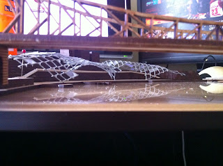
A first attempt at the organic Cover.
By showing davor this attempt he was quite satisfied though he went on further to enhance the model by providing the glass inserts and how it would make a world of difference.

In week 10, i tried to finalize the floor plans as i felt that this "clubhouse" would be the make or break to the design. I had to indentify the location that would most suit it and why. I located it here as it was close proximity to the city cat terminal as well as the staged admin/security centre o f the site. The clubhouse has retail facilities to accomodate the heavy traffic flow and also the users of the site to allow for off-sport communal activities that all cultures enjoy, Food. I've also allowed for a multi-learning space which can adapt for different uses.
Floor Plan.

Typical Facade elevation.

3D model. Even though i made a 3D model i felt as if that this model didn't do the design any justice.

In week 11, i booked the laser cutters at QUT to finalize the clubhouse design. As mentioned earlier the 3D model didn't do the design any justice and by providing a physical model it removes all questions of the design intent.
1:200 Physical model.

This week i also revisited the site to assure that my design was feasible. When i visited the site there was an event at kangaroo point promoting rich music culture. HSW was bare and unused but showed elegance in the evening. The site had so much potential but the government hasn't had any money to put into it yet. After visiting the site i felt re-assured my concept would be ideal for the site.

In week 12, I made sure that i finalised the models as these were imperetive for my design presentation. As long as i had these i was confident that it would be effective in expressing my ideas.

Site model showing the organic roof cover.

View from Brisbane CBD. I have also took on Davors advice and applied a glass like material to the cover.

Aerial perspective of the new cover.

Perspective from access Rd.

perspective from New walkway.

Aerial Perspective of the Clubhouse.

Perspective of the Facade.

Truss system.

Perspective showing scale and relationship between cliff and building.

In week 13, This was my last week to finalize all touchups and prepare for the presentation to officially sell my design to Davor and a guest crit. I found that i was missing a plan of the cover for my design and decided to take a photo and trace over. This would be both time efficient and displays intent.

Photo of the cover which was further traced over to show the covers extent.

Preliminary Site Plan showing the relationship between the river, heritage buliding, cliff and bridge.
A section showing the intention of the cover and the structural solution.


DAB510 - Week 7 Reflection (Project 2 Summary)

This was the period when we submitted for our project two. In hind sight of the submission i thought that most of the requirements on the brief weren't required to "sell" a concept. You don't nessecarily need elevations or 3D's to understand a concept as it is still in the early stages. I do not recommend giving clients 3D's in the early stages as clients generally have a pre-emptive understanding that the concept will be the end product.

My presentation is linked here.

This blog is to summarise my thought about my presentation in class.

Obviously our site is HSW located in Brisbane, Australia. Located on a southern site the site analysis doesn't inhibit a great connection with the cliffs surface.

By identifying the districts i understand that this space connects certain suburbs together. By allowing the connection of a walk bridge it will activate HSW once more. By also implementing a ferry terminal it connects HSW with its souther counterpart.

Through typical analysis of Multi-culturism and HSW (highway no. 1) I figured a multi-sporting facility would be able to function in such an area.

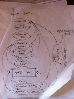
Typical spatial analysis of a larger sporting facility. With sporting facilities and maintaining high quality playing facilities there are major access issues with sporting shoes and casual shoes. The spatial diagram above resolves the issue but requires larger internal spaces where this design proposal is external with just a large cover.


This diagram indicates my intention with the sporting layout due to the space allowed for the sports. It was a first go at the spatial layout in a masterplanning scale. When presenting this i also displayed the rear connection along the cliffs and the cover i intend. This lacked a 3D aspect but showed my intention quite well.

Lastly i showed the section intent through the connections both visually and envionmentally of how a form like this can work.

All in all i think i did a good job considering this is just a concept and got my point across with effective diagramming.

Sunday 8 April 2012

DAB510 - Week 6 Reflection

This week we had Professor John Frazer lecture us on "Computing without Computers". In short he made a discovery of instigating an idea within a set amount of parameters and algorithms to let a computer model develop it into a million outcomes. This is based on the cells to the finest degree. He argued that our cell and genetic structure are more advanced thnt our intellectual knowledge at this stage and this is true. These cells consist of both generic and site specific functions. Generic just for the growth and specific for the adaptability.

The program he used is different for all applications. My question in regards to this computer based design solutions is the quality of design. As humans we are developing an understanding of space and to accomodate its evolution. There is no one use space can be used for and this is why i question the quality of a computer simulated design resolution. Not only this but as architects we tie spaces together to work harmoneously, the feel, the touch, the sensory, the smells. I don't believe a computer could analyze this though in the applicaitons shown on screen as to where light penetrates through a site and optimal room locations is quite beneficial (but this can be formed on any type of applicaiton in this decade).

Unforunately this week Davor was in NZ and unable to attend the tutorial. I went through the site with some peers to understand the positives and negatives of the site. All the statements below are based purely on functionality.

Constraints:
  1. Existing buildings must be kept.
  2. Security on site.
  3. Transitional spaces
  4. Public Transport (Ferry)
The existing buildings serve a purpose on site for there sole functions  and the removal of this wouldn't be a suitable solution. Prior to the floods there was a chainwire fence with barbed tops seperating the transitional spaces from the industrial.

The site proves to be a difficult site because of the south facing situation. During winter minimal light will penetrate unless the space we create is on the rivers edge but this minimizes to connection of the space to the cliff. During Summer at midday sun will penetrate the whole site but this is unwanted as our tropical climate proves this uncomfortable.

DAB510 - Week 5 Reflection

The lecture explained details of the industries current methods in procurements and what our role is within the industry. The lecturer (Prof. Mark Burry) explained that from the start, you will receive a brief but this will change nothing. You will always have to reverse brief the client to provide design solutions but in doing so, design is a developing idea to create innovative spaces he also elaborated that design is never finished, not even when the job is completed. There will always be kinks in the design which you or the client will have to resolve.

This tutorial was the first time for many that met Davor and in his introduction he described his philosophy as "there is no point of designing a building which does not function". We all introduced ourselves and explained what we think of "inter-cultural community's".

My interpretation of this tutorial group was to learn about others cultural identity within the group and how it relates to Brisbane to create a foundation of knowledge about Brisbane's culture... well the students culture. I find the quickest way to learn about culture is through interaction, observation and participation and this tutorial explores all of these aspects.

We further separated into groups of four to delve into the sites functionality and the idea of inter-culturalism. These are our findings.


First we looked at the current uses and how that may impact on the design concept with the constraints.

Current Uses:
  1. Bike Path (connecting the city, newstead and valley together)
  2. Heritage (bomb shelters)
  3. Ferry Terminal
  4. Hardstand storage (Industrial uses)
  5. Views (Tourism)
  6. Connection of the River, Cliff and bridge.
  7. Dock.
Possible Uses:
  1. Place + Culture = Space?
  2. Public Space
  3. Transitional spaces
The possible uses were very broad as to define a functionality of the space. So we tried to break it down further. What is inter-culturalism? Is there any such thing? By creating a space dedicated to a culture does that embrace it?

My understanding is that even if we create a blank space for a sole purpose, it can still embrace inter-culturalism due to its capability of being blank and able to adapt to different cultures. By creating a space dedicated to a certain culture will work as well due to people feeling out of place, removed of the social position and share the experience of culture. By creating a space for all cultures, this will result in not enough depth into the design and is rather ignorant to our own identity.

Our next approach was to identify certain functions that remove all cultural barriers and we understood that the following proved effective:
  1. Food
  2. Leisure
  3. Sport
  4. Music
 During the presentations of our findings i had a mental epiphany which raised questions in regards to time. Time as both in 24/7 and the adaptability of this project to the future. I think there will be issues in security of if the proposed space is to be functional 24/7. The project i think will require easy adaptability to the futures uses.


Saturday 24 March 2012

DAB510 - Week 4 Reflection


Above are the submitted panels which were created to emphasize easy understanding of the concept and welcoming graphic design.

During the lecture we were introduced to the theme groups and there were interesting themes along with a few airy fairy themes. My interest lies in the Inter-cultural designing as this is one of the major concerns for designing in the real world at the moment. At the moment we have architects who do address these issues but just scratch on the surface. Gregory Burgess addresses aboriginal culture quite well and develops the understanding that architecture can communicate there dedication to their land. An example of one of there better known projects would be the Uluru Kata-tjuta Cultural Centre.

The other interests were 1:1 architecture and the Library one. 1:1 is quite interesting due to the knowledge the PHD student posess' and what he could share in regards to the standardization of Archicad/Revit and how design is limited or way too complex due to the programs we use. We need to find a balance between technologies.

DAB510 - Week 3 Reflection

Through this week we resolved the concept behind the design and were struggling with locating the Folie. Why? The context is there but the uses of the space and how people transit the site is rather an unknown territory and we can only assume that the site is going to be reinstated as it was previously pre-2011 floods.

By assuming this we had identified the edge of the site where it links all three districts, Fortitude Valley, City & Newstead together. This would be a great position due to the proximity of the city and demand.

By proposing the Folie where it is situated it will create a defined area where "learning" folies can be created in unison. This Folie will be the first of several installations. In the not too distant future we will install other sensory experimental Folies.
As this is only a concept we agreed to keep it very minimal and open to suggestions. Renders are kept to a minimal but enough to have a sense of scale and the materials installed. This is to develop the users understanding of the concept proposed. This is our constructivist stab at it trying to tie it to the story bridge whilst maintaining geometric shapes both aesthetically and functionally.

Sunday 11 March 2012

DAB510 - Week 2 Reflection

Through week two's lecture, certain questions were raised, along with a more defined brief. What is learning? how can we engage with it? How can space be developed enough to be self learning? is this the future for space? I understand that as architects we can create spaces that function towards teaching from students to teachers but how can space be be learnt?

What does learning mean?
  • to gain knowledge or skill by studying, from experience, from being taught etc.
Architects can create spaces for the definition above, but in a "folie" context, i believe learning is achieved through "experience" rather than studying or being taught. In short, a space that can be learnt from. This space can further adapt and individuals can be apart of the folie in how they occupy the space.

Typical design ideologies are to be considered such as context, district, time, season, even, cultural & social factors and is to be displayed in a graphical method of diagrams. The main underlying issues presented in class which we are to identify in depth are as follows
  • Tension/Compression
  • Heavy/Light
  • Solid/Void
  • Bright/Dark
  • Natural/Artificial
  • Soft/Hard
  • Comfortable/Disturbing
  1. Abstraction - Impression/filter/perception (interaction).
  2. Metaphor - Narratives/analogy/comparison.
  3. Scale - Point of view/perspective/relationship.
 In the tutorial there was a single tutor with a theoretical background providing more questions rather than answers. Rather than defining the brief and the issue he created more invalid points. The important aspects he provided were that we have to create a problem and resolve it through our folie.

Our group had a few concepts which created a bit of confusion as to what is right. Obviously there was no right answer, though agreed upon my general concept and problem. My problem i set out was, "How do we become more aware of people with disabilities with the general context of Brisbane's culture?" I understand that there are building codes out there to comply with, but this is rather ignorant to understanding the real issue. There is no code to understand there situation or what they're feeling, yet we are to design based on codes that are written in books. Buildings with PWD accessibility is a must in this society so we must change the thinking process behind our designs for the future. For the benefit of the social & cultural issues of Brisbane as an entirety.

PWD is a very broad term in which it classifies all disabilities in one. PWD stands for "People With Disabilities". This can refer to the blind, the partially blind, elderly, paraplegic etc. What they all have in common is due to the fact that they are missing one of there essential senses the other 8 are heightened to compensate.

The 9 senses:
  1. Sight
  2. Touch
  3. Smell
  4. Taste
  5. Sound
  6. Heat
  7. Kinisthetic
  8. Balance
  9. Physiological pain
 Through architecture we learn through experience. My concept revolves around a journey through losing sight partially and become more aware of how essential it is. Initially its a juxtaposed design concept where the exterior is solid geometrically a cube but internally it consists of organic lines. This is the first stage of being blinded by your vision, deceived by your sight. Through the journey you will have to use your sense of touch to guide you to the limited light penetration. Whilst touching your hearing sense will be more in tuned with the sense of kinisthetic being applied to the internal space. You will reach the middle and feel tactile which identify danger to the blind. Through the hump you will use your sense of balance, considering that there is limited light, this will be a difficult task. The moment you exit you’ll be glad to be out. Have an epiphany and re-connect with the world with your heightened senses and acceptance of the blind? 


I found the hardest problem with my design was just situating it on site since its large scale and tying it to the context. My raw concrete is to be tied into the existing debris there from "history". This folie is to create a space where we can understand their situation and how we can relate and communicate with people with disabilities so that "understanding disability is of the past".